The job market for designers is brutal right now. Whether you’re a junior, mid-weight, or a senior level designer – open roles are getting flooded with hundreds if not thousands of applications.
On top of that, companies are using ATS systems to sift through applications, which makes it hard to even make it to the initial HR screening process, let alone an actual interview.
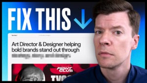
So, what can you do to give yourself the best possible chance to stand out and get hired? It all starts with your resume. I mean think about it, it doesn’t matter how great your portfolio is if you’re not even making it through the initial resume screening, right?
That’s why in today’s video I’ll be showing you exactly how to design and write your resume for the best chance to stand out to both ATS systems as well as recruiters. Let’s get into it!
Okay so today we’ll be creating the perfect resume and cover letter for designers. We’ll mainly be focusing on the design itself, how to lay things out for ATS scans, and the sections you need to include, but I’ll be touching on how to write each section as well.
If you’re looking for a deep dive on writing effective copy for your resume, be sure to check out my last resume video which I’ll link above and in the description below.
That’s been one of the highest viewed videos on the channel so I appreciate all of the support, but one of the biggest call outs in the comments there was that you guys wanted to see more of the actual resume design itself, so that’s what we’re covering here today.
I’ll be jumping into Figma to show you a template I’ve designed and tested which you’re free to reference or copy as you see fit, or if you want to save yourself some time and support the channel, I’ve made the file available on the Artful Ruckus store for a few bucks.
The template comes with Figma and InDesign files for both resume and cover letters built on a pixel-perfect 12 column grid. I’ve designed everything using a dynamic style guide so you can match the fonts and colors to your personal brand in a matter of seconds.
I’ve ran the template through various ATS tools and verified that it scores high on readability and all the information is pulled in correctly. The template also comes with tons of writing advice that will help you write the perfect copy for each section. This is the exact resume design and layout I use myself when applying to jobs as an Art Director and it’s gotten me plenty of call backs and interviews – so I can confirm first hand that it works.
I’ll place a link to the shop up above as well as in the video description – a big thank you to those of you who support the channel – buying templates and scheduling 1 on 1 meetings with me helps me be able to keep making content like this.
Okay let’s jump into Figma and start by taking a look at the overall design.
When it comes to the design of your resume, less is more. I see a lot of graphic designers that try too hard to showcase their design skills on their resume, and it ends up detracting from the legibility of the information.
Your resume is an opportunity to showcase your mastery of grid, layout, hierarchy, and typography. Legibility and content are king here. Things like headshots, skill graphs, icons, and background elements are unnecessary and often come across as unprofessional – confusing ATS scans and distracting recruiters rather than adding value.
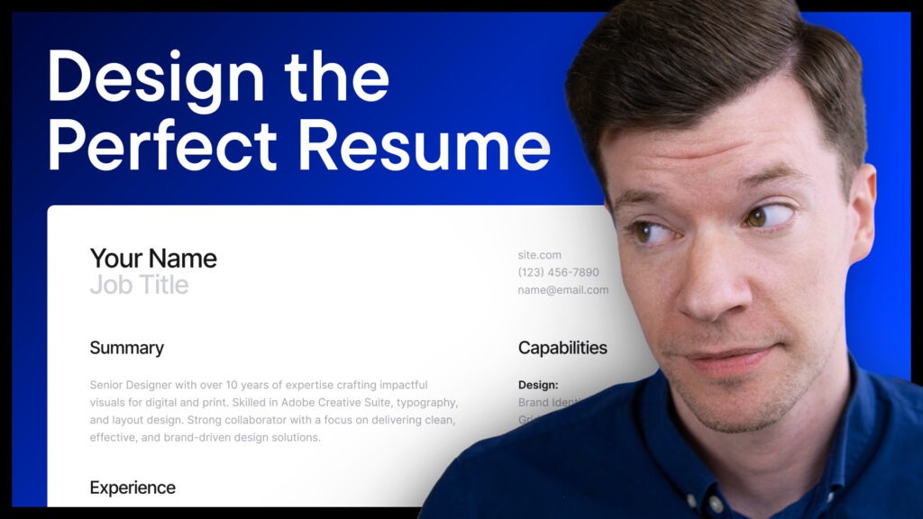
As you can see in this template, the design is reserved and isn’t trying to do too much – I’ve put everything in a 12 column layout on a 4 pixel grid, so the spacing is consistent throughout and pleasing to the eye.
Using a strict grid shows hiring managers that you have a mastery of the fundamentals, that you pay attention of the details, all while making the information easy to read. I find that a lot of junior and mid-weight designers don’t use grids and rather just eyeball things, and as a hiring manager myself, I can tell you that it makes a big difference when I see a grid system being used properly.
Note that I’ve designed this template using 2 columns. This is the layout I personally use as it’s easier to read and have found it performs perfectly in ATS scans. If you’re weary of two column layouts and would rather use a 1 column, you can quickly drag out the main column and place the info from the second column at the end of the resume.
Okay next up let’s talk about Typography. This is an area where it’s important to establish a system for your resume that creates a hierarchy that’s easy to skim and jump from section to section. That means there should be an obvious difference between your header section, job titles, and body copy that can be scanned quickly by both AI systems and recruiters.
One mistake I see a lot of designers making here is that they use too many fonts, weights, and styles to try to make things visually interesting. Again, your resume is a place to highlight restraint and your ability to lay out a lot of information as simply as possible.
As you can see here, I’ve created a style guide for the resume and cover letter that utilizes 2 fonts (Inter Tight for larger headlines and Inter for body type), 4 type styles (H1, H2, H3, and Body), and 4 colors (Header, Accent, Body, and Background). Obviously you don’t have to use these exact fonts, styles, and colors, but I strongly recommend limiting the number of fonts and styles you’re using as I’ve done here. Less is more!
Color is another area I recommend keeping minimal. As you can see in the template, I’ve gone with a monotone color palette that utilizes shades of grey to create hierarchy and separation between headings and body copy.
I’ve included an accent color in the style guide which is linked to the job title in the header if you’d like to establish a brand color here. You could potentially tie the accent color in a little more on the job titles or similar, but this is another area where it’s best to show restraint. I would recommend limiting your accent color to under 10% of the overall palette to keep things professional and focused on legibility.
Okay so now we’ve covered the overall design, let’s take a look at what sections you should be including in your resume.
The first section you should have right at the top is a header that includes your name, job title, portfolio link, phone number, and email address. You can include a link to your LinkedIn here as well as long as you’ve been keeping your page up-to-date. If your LinkedIn is outdated or doesn’t paint you in the best light, feel free to leave it off.
The goal with putting all of this info right at the top of your resume is to make it easy for hiring managers to have all the most important info they need right off the bat. This is also the info that ATS look for first, so it’s important to provide it at the top where the system is expecting it.
Something to note here is that you should add an actual clickable link to your portfolio address so recruiters can click through without having to copy and paste it – go the extra mile to make things as frictionless as possible.
The next section I recommend including is a Summary section. This is essentially a short 3-4 sentence elevator pitch that quickly establishes who you are, what sets you apart, and your relevant skills and experience.
Be sure to tailor the skills and experience that you’re highlighting in your Summary section to the requirements of each position. For instance, if you’re applying to Art Director and Brand Design roles, you can create two resumes, one that highlights your Art Direction skillset and one that highlights your Brand Design experience.
This instantly sets the table and shows recruiters that your resume is worth looking through due to how well it matches the job. A Summary is also beneficial for ATS scans because it’s an opportunity to reinforce keywords from the job description that makes the AI overlords happy.
Next up is the section that will make up the bulk of your resume, the Experience section. This is where you should include all of your relevant past jobs, highlighting your job title, the company name, the dates you worked there, the location, and 2-3 key accomplishments from each.
I’m a fan of using the bullet point approach rather than paragraphs as it makes the information much easier to scan and creates clear delineation between each accomplishment.
As far as the information to include here, you should be writing in an active voice and highlighting tangible accomplishments. You want to showcase that your work has a strong ROI and that your projects were undeniable successes.
For example, instead of saying something like ‘I worked as the lead social designer, crafting multiple new campaigns that helped grow our socials and increased post engagements’, you should say something like ‘Launched 15 social campaigns in 2025 that increased Instagram following by 25% and drove over 500,000 engagements.’
The second example is much more action oriented, to the point, and tangible – showcasing metrics, an improvement over previous results, and a timeline in which it happened.
Just like with the Summary, be sure to tailor the accomplishments you’re including for each job you’ve held to the positions you’re applying for.
The next section you’ll want to include is a Capabilities section. This is where you can list your soft skills and tools that you have expertise in. This section essentially works as a checklist for hiring managers as well as ATS scans, quickly reinforcing that you have the necessary skills for the job and you have experience with the required software.
I strongly recommend staying away from skill graphs and sliders here – telling a potential employer that you have an 80% proficiency in Photoshop doesn’t tell them anything useful, and only serves to hurt your value as a candidate.
You don’t have to be a master of everything you list in your Capabilities section, but you should have a functional, working knowledge of anything you include there. Stay away from including skills or software that you don’t actually have much experience with as that will quickly be obvious in an interview or on your portfolio – nothing will get you disqualified as a candidate quicker than getting caught in a lie.
Finally, the last section we’ll talk about is an Education section.
For mid-weight designers and above, this should be a short section at the end of your resume that includes where you went to school, the degree you earned, and the year you graduated.
For college students and recent grads, this section becomes more important and can be placed after the Summary. Since you likely don’t have much relevant job experience yet, you can build out your Education section with relevant projects, awards, clubs, extra-curricular activities, and your GPA.
Do your best to write about your projects and education similarly to how we wrote the experience section – using action verbs, bullet points, and tangible metrics whenever possible.
Okay so now we’ve covered the overall design of your resume as well as which sections to include.
Some other things to note here – if you’re a senior designer and have a lot of experience, feel free to make your resume 2 pages. Before ATS scans were commonplace, I was a fan of keeping things to 1 page, but now brevity is less important and showcasing your skillset and experience is king.
Another thing to note is if you’re exporting your resume as a PDF, be sure to use the PDF Export with Text plugin that I’ve linked in the template file. Figma still hasn’t quite perfected their native PDF exports, so ATS scans can’t scan them properly and text appears jumbled when copying and pasting.
Lastly, be sure to write a cover letter for any positions that give you the option. I know it can be time consuming, but with so much competition out there it’s important to do everything possible to set yourself apart.
Your cover letter should match the same typography, colors, and styling of your resume – in the template I’ve tied everything to the same style guide to make keeping them aligned quick and easy.
As far as cover letter content, you should start with a short elevator pitch talking about your skillset and what excites you about the potential role in the first paragraph. Next, move on to highlighting relevant wins and accomplishments from your previous roles that align with the job requirements. Finally, wrap it up nicely by reiterating what most excites you about the company and express your interest in learning more.
Your cover letter doesn’t have to be a novel, 2-3 short paragraphs is plenty. The main goal is to highlight your strengths, accomplishments, and genuine interest in the role.
Okay so now you should have the ideal resume to land your next design job – a clean layout, pixel-perfect grid alignment, and clear hierarchy along with purposeful achievements backed by tangible results. Whether your resume is being scanned by an ATS or being reviewed by a hiring manager – you’ve got it covered.
I hope you found this info helpful and you were able to make some updates to your resume. For everyone on the job hunt right now, best of luck and keep your head up.
A huge thank you to those of you who pick up the template and support the channel, and thanks to all of you for tuning in – now go out there and make a ruckus.
This free download will help you attract more clients and land that design job you’ve been dreaming about.
📈 Showcase your value to clients and recruiters
✍️ Write engaging case studies
🔥 Stand out in a crowded market
This free download will help you attract more clients and land that design job you’ve been dreaming about.
📈 Showcase your value to clients and recruiters
✍️ Write engaging case studies
🔥 Stand out in a crowded market